
Project Overview
Background
Established in 1994, Mirror is a clothing store targeting a budget-minded audience looking for low-cost clothing for any occasion. The quality is good but the prices are low. Their main goal is to make clothing accessible to everyone.
Mirror is a very successful brick-and-mortar chain with over 400 stores around the world in 32 countries. Customer perception of the in-store experience has been cited as well-kempt and clean. Having refrained from investing in an e-commerce storefront, Customers have been asking about it for years, highlighting the convenience of online shopping.
Objective
Create a responsive e-commerce marketplace to boost sales revenue and refresh Mirror’s outdated logo to add more appeal for potential customers.
Research Methodologies Used
Competitive Analysis
User Interviews
Secondary Research
User Personas
Usability Testing
My Role
UX Researcher
UX/UI Designer
Branding Design
Research
Market Research
To help me frame the problem more clearly, I conducted research by collecting data on e-commerce best practices and market trends.
FREQUENCY
75% of people who shop regularly, shop online at least once a month
SITE ELEMENTS
Search, navigation and product ratings are the most important elements to online shoppers
SALES PROJECTIONS
By 2021, 54% of E-commerce sales will be made through mobile devices
TECH INNOVATIONS
80% of online shoppers think tech innovations improve the experience
CART ABANDONMENT
Added costs and forcing users to create accounts are the two top reasons for checkout abandonments
FREE DELIVERY
The top reason consumers prefer to buy online is free shipping options
Market Research
After gleaning key data points from my market research, I dove deeper with an analysis of competitors in the e-commerce clothing market.

User Interviews
In order to determine how to create a pleasant experience, It was imperative to speak to users about their expectations and frustrations with online shopping.
I was able to recruit 4 participants ranging from 25 to 62 years old with some familiarity with e-commerce brands and online clothing shopping.
Key Insights
User Needs
All participants need to know how their clothing will look and fit. 2 out of 4 participants need clear and prevalent filtering categories and easy-to-find clearance/sale sections. Participants also generally need easy navigation and a clean layout.
User Wants
All participants desire quality clothing at a good price. Participants generally want easy checkout processes, detailed filtering categories to find specific items and consistent sizing.
Pain Points
3 out of 4 participants cited not being able to try on garments as their primary frustration with online shopping.
Motivations
All participants emphasized the importance of sales and clearance sections when shopping online. 3 out of 4 participants felt more inclined to shop if the UI had a clean and minimal design. All participants were motivated to shop online due to convenience and ease of use. Quality and price are generally important motivators as well as comfort.
Defining the Persona
Using the data gleaned from my compiled research so far, It was time to create a persona to understand our potential users and begin building a solution.

Information Architecture
Mapping the Site
To guide the construction of the site, I conducted a card sorting exercise with 8 participants. The results from which was imperative to building the sitemap

Determining the Flow
Before I could begin building an MVP, I mapped out task and user flows while keeping my user’s motivations and frustrations in mind.


Ideation
Designing the solution
Synthesizing all of my research into a clear idea of how the site should function, The next step entailed sketching out potential solutions and subsequently wireframing the sketches.


Defining the Brand
After laying out the digital storefront, The next step was crafting the brand identity and the story they aim to tell to their customers.

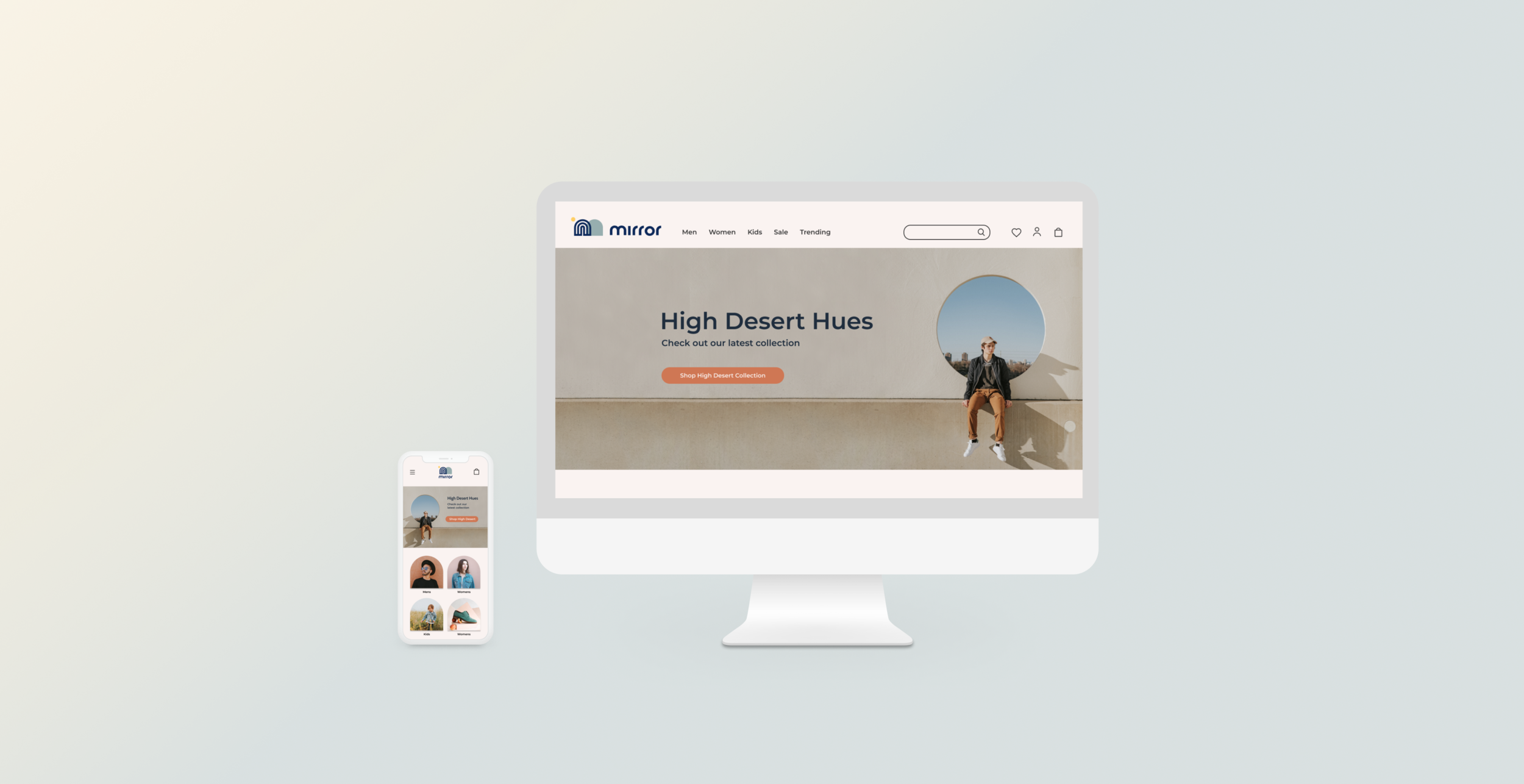
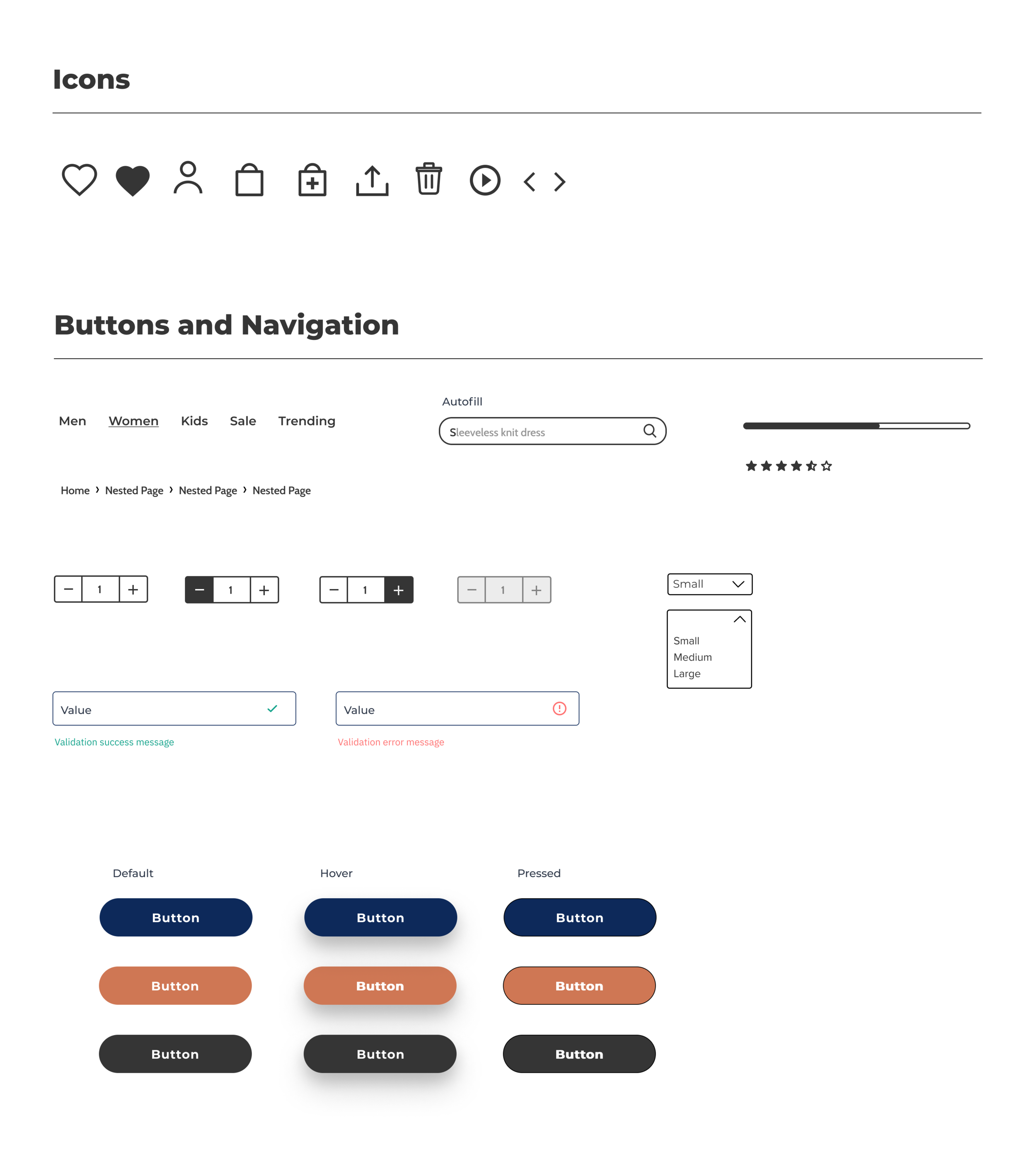
UI Kit

High Fidelity Screens

Usability Testing
After applying the UI visuals over the skeleton, It was time to test the MVP to determine ease of use and uncover potential areas to improve.
Overview
Moderated In-person testing
4 participants
Subject: High fidelity website prototype
Insights
Participants found the layout and color choices relaxing and navigation relatively clear
The visual hierarchy was well organized
Participant 3 preferred a more prevalent sales CTA in place of the hero image
All participants highlighted consistency in navigation elements
All participants felt the checkout flow was easy and clear
All participants preferred some form of an order confirmation page
Participant 3 was confused by the lack of visual price reductions on the product results page
Iteration and Implementation
Using an affinity map, I was able to highlight several patterns that I could use to iterate the prototype further.

Refined Prototype


Outcome and Findings
Throughout this process, I found I had to alter my thinking process and let the user guide my design process rather than using my biases to inform my process. Form does follow function after all. I am happy with the end result, however, refinements, iterations, and more research could be done to further improve the product.
Next Steps
Iterate and Refine
To refine and improve user experience, I plan to make adjustments to UI elements including hover and press animations, build-out modals such as Promos, Signup, and Fit Attendant, as well as adding a favorite/share functionality.
Further Testing
To further improve the product, I will complete more comprehensive testing with a wider audience for each iteration. Adjust prototype according to new data.